
How we help business grow
We combined our individual expertise to offer a seamless bridge between data and design. While Andrea ensures your ads reach the right people, Valeria ensures they are impossible to ignore.
Together, we provide a holistic approach.
Our Ad Results
Turning offline trust into online results
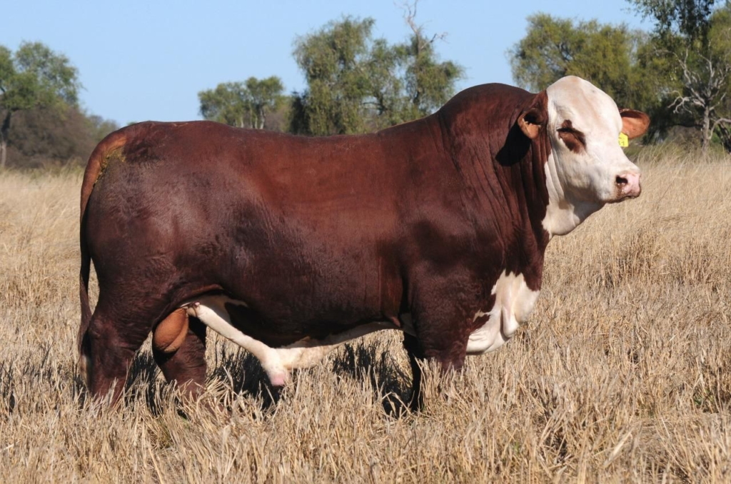
Digital strategy for a long-established livestock brokerage.
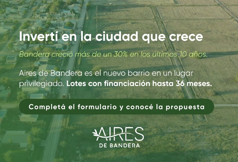
Consistent leads for a real estate development
174 qualified leads per month at $0.25 per lead.
What our clients are saying
Creative Portfolio
Creative work designed to communicate clearly, strengthen brand identity, and support performance — not just to look nice.
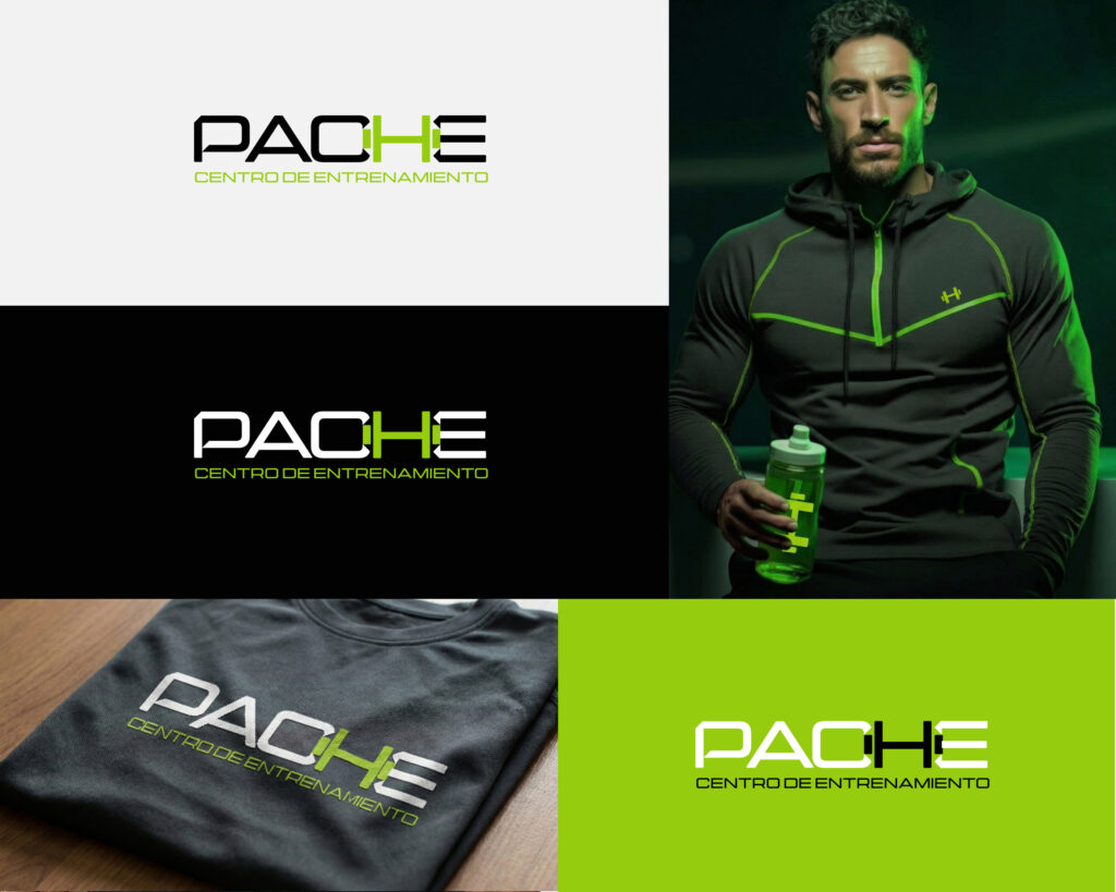
Pache Training Center
This project involved the redesign of the Pache Training Center logo, with the goal of updating its visual identity and aligning it with a more modern and technological aesthetic. The original color palette—green, black, and white—was preserved as a key brand element, reinforcing its energetic, dynamic character and strong connection to high performance.
The new visual system was applied across different apparel pieces, such as t-shirts and jackets, as well as merchandising elements. The icon was designed to work both independently and as part of the full logo, allowing for versatile and consistent applications on items like sports bottles and other branded materials.
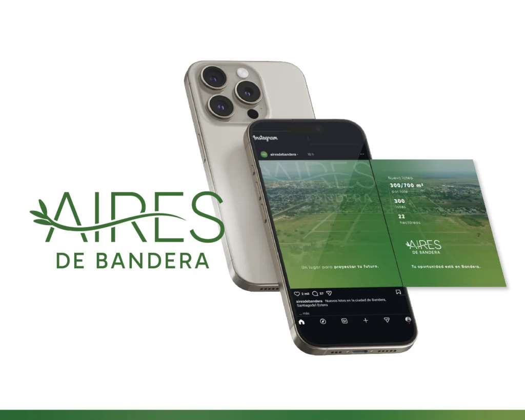
Aires de Bandera
The visual identity for Aires de Bandera was developed for a high-end open neighborhood located in the city of Bandera, with a proposal focused on future projection, family life, and a strong connection to nature. Given the limited availability of visual material of the area, the challenge was to build a visual universe capable of conveying sensations, aspirations, and lifestyle rather than the physical space itself.
A color palette based on shades of green and white was used to evoke calm, growth, and a natural environment, and was applied across graphic pieces and digital content. The brand aims to communicate a space designed to be envisioned, lived in, and grown into—reinforcing the idea of home, well-being, and future through a clean, organic, and contemporary aesthetic.
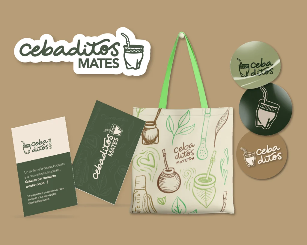
Cebaditos Mates
The visual identity for Cebaditos Mates was created for a mate brand featuring engraved designs along the edges, with the goal of building a friendly, approachable, and authentic brand. For this project, a hand-drawn custom typeface was developed, along with digitally illustrated mates, emphasizing the artisanal and personal nature of the brand.
The color palette—based on earthy browns, creams, and greens—evokes a natural, countryside feel, reflecting the mate as an everyday object tied to sharing and connection. The identity was applied across graphic pieces and merchandising, resulting in a cohesive visual system that conveys warmth, tradition, and closeness.
Want to see if this approach fits your business?
Free call · No commitment · No sales pressure